SANDWAY - farnham
Sandway is an extraordinary example of well-integrated contemporary architecture into a challenging traditional English village setting.
It showcases how modern design can work effortlessly in a historical context and is a must-visit for anyone intrigued by the fusion of house and garden. This contemporary dwelling in a beautiful English village in Surrey's Green Belt and Area of Outstanding Natural Beauty draws inspiration from a formal Walled garden and minimalist Japanese courtyard house. The design focuses on honest materiality, craftsmanship, and the relationship between indoor and outdoor spaces, using carefully selected and handcrafted finishes.
The front of the house features defensive architecture for privacy and security, while the back opens up to a large covered terrace for year-round alfresco living. The client wanted a secure, timeless, and integrated design that blended with the surrounding landscape. Sandway blurs the line between house and garden, with trees passing through the roof and a garden hiding behind the front canopy. The finishes transition seamlessly between indoor and outdoor spaces, and a small courtyard provides a unique openness to the master en-suite.
As you approach the house, the space compresses at the entrance and expands twice, first in the gallery entrance hall and then again in the double-height living area. The front door is a minimalist corten pivot design that previews what to expect throughout the house. Every detail has been thoughtfully chosen, and the finishes softly touch each other.
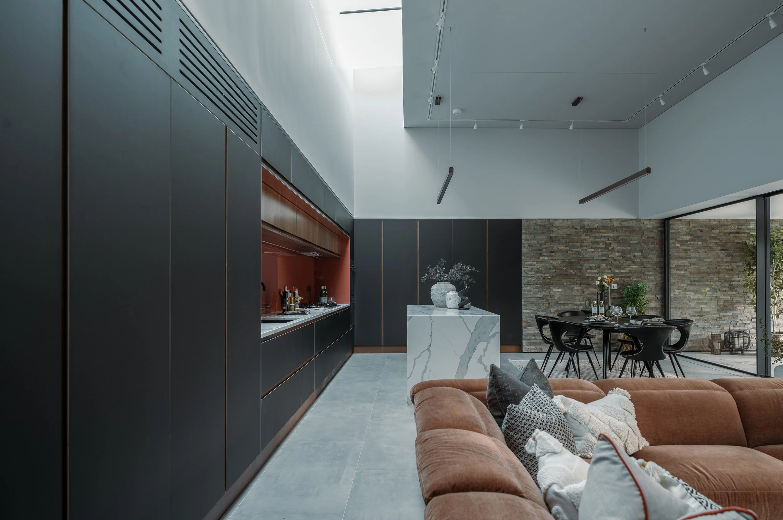
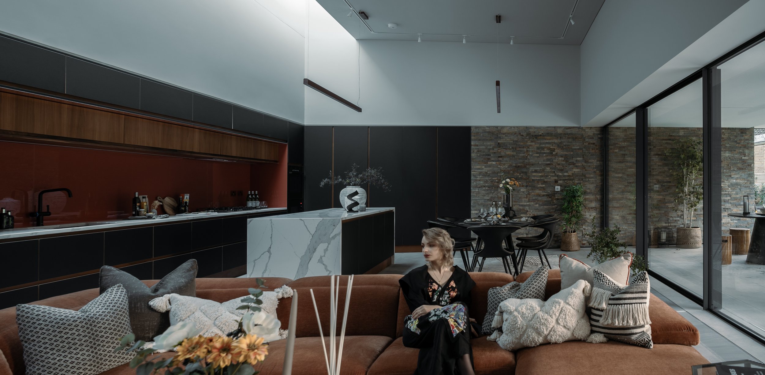
The central living spaces serve as the heart of the house, while the bedroom wings provide dedicated spaces for both the main bedroom suite and guest bedrooms, ensuring privacy and separation. The living areas and main bedroom also boast sizeable sliding glass doors that offer easy access to the rear garden.
A limited finishes palette focusing on corten steel, stone cladding, and concrete enhances the subtle design features. Rusty tones in the stone cladding complement the corten steel and are used inside and outside as an accent finish. Warm walnut and bespoke ply joinery designed for each room provide ample storage while maintaining a minimalist feel throughout the house.
Book a consultation today and start your design journey!
alfresco living
Expressive Juxtaposition
The main living areas connect to a covered terrace for year-round alfresco living. The terrace is divided into separate "rooms" with distinct characteristics, providing a subtle transition between indoor spaces and nature.
The house juxtaposes defensive architecture in the front to provide security and privacy, while the back opens up to a spacious covered terrace perfect for outdoor living year-round. The client emphasised the importance of a secure, timeless design that blends well with the surrounding landscape.
Hole life carbon
When it comes to carbon footprint, the dwelling takes a fabric-first approach with a high mass structure to reduce cooling and heating loads 'in use' and considers the Hole life carbon footprint approch. In addition, all envelope elements have been designed to meet the passive house standard.
We conducted an early Stage two analysis to determine the best structure design. We decided to create a concrete structure that is fully integrated with increased rigidity and high thermal mass. The size of the structural elements has been further optimised by adjusting the rigidity tolerance to the structural elements and allowing the structure to deflect naturally. This allowed the system to operate at almost full capacity, resulting in a sleek, thin design, even for cantilevered elements.
We have carefully considered our finishes' environmental impact and prioritised those that use minimal natural resources or have high recycled content. The corten steel finishes have been designed in large panels minimising secondary structure and being easily removable and recycled at the end of their life.
The M&E services are designed for easy upgrades. We have installed a man-safe system on the lower roof, allowing for efficient renewable services to be added later. Additionally, a perimeter service void around the upper structure provides easy distribution for future services.
Compress and expand
Upon entering, visitors experience a sense of shelter and intimacy in the compressed front entrance with low ceilings and dim lighting. This warm and welcoming atmosphere contrasts with the bright and spacious gallery entrance hall, featuring a large skylight that showcases art and creates a grandeur feeling. As we move deeper into the building, we reach the main living area, flooded with natural light, providing expansive views of the surrounding landscaped garden. This bright and airy space gives a sense of freedom and relaxation. In contrast, other areas of the house have lower ceilings and less natural light, providing a sense of intimacy and privacy.
Blurring Boundaries
Sandway blurs the boundary between house and garden. Trees grow through the roof, which creates a unique visual effect and connects the inhabitants with nature. The finishes transition smoothly from indoor to outdoor spaces, and LED strip lights continue from the terrace into the house. To create a sense of openness and connection to the outdoors, Sandway incorporates a small courtyard into the design of the master en-suite. Large sliding glass doors allow natural light to flood the bathroom to create a relaxing and unique atmosphere.


